


Someone in the field of graphic designing, or who recently started pursuing the course might have already come across two common terms – infographic and data visualization. While it may appear common to a layman, a graphic designer knows the contrasting nature of these two. But, to ensure a flawless business, you need to pick the correct approach. Choosing between data visualization and infographic can be baffling, but this article will detail all the differences between these two elements.
Grafana is one of the most popular open-source solutions for data analytics due to its proficiency in visualisation, querying and alert creation on both metrics and logs. Try Grafana hosting
What is Data Visualization?
Data visualization can be described as a miniature of a specific numerical data set. Data visualization creatively turns a complex, quantifiable, and objective data set into an interesting and easily understandable one. They generally target a trivial data group and turn it eye-catchy. Data visualization is technically simpler since it targets a small group of data like answering one question or a single statistics data set.
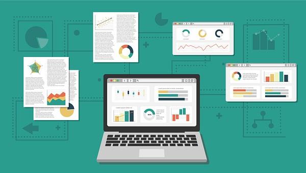
It is majorly automated in the form of charts, plots, graphs, and similar frames with the help of a computer program. The data visualization technique involves opting for a specific set of numbers, and transforming them into an image. This way, the audience tends to grasp the visuals better leading to smooth communication.
Data visualization acts as a boon for organizations dealing with a vast quantity of data. Non-tech companies might find it difficult to decode such convoluted information by scrolling through it. Even if they do, it will take them hours to understand those raw data. As an organization, it might inflict undue pressure on potential customers, managers, or clients to understand the data. Data visualization will streamline the process, and highlight what’s important.
Some examples of data visualization are bar graphs, scatterplots, flow charts, line graphs, pie charts, pictographs, Gantt charts, maps, and hierarchy diagrams.
How to Improve Digital Marketing Campaign using Data Visualization
Implementation of Data Visualizations
Now that you are aware of data visualization and its purpose, let us throw some light on its uses. From apps to computer programs to online portals, data visualization is the key to offering information in a fun manner.
For instance, you might often encounter money management apps where a pie chart shows the percentage of your salary spent on electricity bills, groceries, maid, rent, and so on – that clearly describes data visualization. It is only through a glimpse that you will be able to locate where you majorly spend your salary on.
Data visualization is quite an engaging approach to presenting long information, documents, or a thesis maybe, by simply putting out the highlighting and vital points or statistics. Some of the common places where this representation can be implemented are:
- Presentations and slide decks
- Social media micronarratives
- Mini-infographics
- Annual reports
- Whitepapers
- eBooks
- Conference booths
- Informational brochures
Benefits of Data Visualization
To understand data visualization better, knowing its benefits holds greater importance.
- It unlocks key values by retrieving massive data. It might be quite hectic to perceive those huge chunks of data in a meeting, or project, this representation eases the process of understanding and unlocking the values of the data.
- It recognizes the hidden patterns in the data that couldn’t have been identified before. Through these visualizations, decoding the meaning and pattern becomes easier.
- The ease of understanding any raw and complex data increases with the incorporation of data visualization since it highlights crucial data only.
- It offers more engaging and attractive content through next level-visualizations.
What is Infographic?
An infographic or information graphic describes a vast collection of data in a simplified visual representation. Finding it similar to data visualization? But in actuality, it is different. An infographic deals with a greater amount of data, unlike a single data visualization representation. An infographic maker covers a diverse range of topics unlike a specific data set of data visualization. From subjective data set to an encyclopedic data-heavy topic, an infographic constitutes all.
To make it simpler, an infographic is a dwelling for multiple data visualization. You will often find this feature paired with short blurbs, additional pieces of text, or quotes. Though infographics comprise countless statistical and quantifiable data, it doesn’t leave a common ending or a single conclusion. One of the main purposes of infographics is preaching to the audience about a certain topic to provide in-depth knowledge.
An infographic template alleviates in catching information and developing cognition through their advanced graphical patterns and trends. The evolution of this representation has tremendously matured in recent years. The current market scene has consumers often shy away from the sales pitch. Therefore, marketers create infographics to educate consumers about the product or service.
Implementation of Infographics
Infographic is often considered a one-man-army since no fancy add-ons are required to anticipate it. Though you might encounter an infographic with an introduction that is not mandatory. This representation is primarily based on story-telling and is widely used in numerous instances. Numerous free infographic makers make the representations for:
- Case Studies
- Flyers
- Brochures
- Blog posts
- Website Content
- Social Media
- Posters
Benefits of Infographics
To identify if you truly require an infographic, consider the below benefits.
- Since this representation amps up information processing, it makes it simpler for the audience to understand the data, resulting in decision-making.
- It enhances content exposure through the presence of meaningful data and compelling visuals.
- It increases content accessibility making it easier for readers to share.
- Your brand credibility increases with the help of an infographic. An original infographic is a way of presenting yourself as an industry leader.
An Ultimate Guide to Data Visualization in your React Applications
Difference between Infographics and Data Visualizations
An infographic frequently includes numerous data visualizations, whereas a data visualization is just one (such as a map, graph, chart, or diagram). Infographics incorporate additional components like narrative and images, which is a second significant difference. In addition, infographics typically require more effort to design in order to increase their effect and aesthetic appeal.
The main distinctions between infographics and data visualizations are outlined in the table below.
| Parameter | Infographics | Data visualizations |
|---|---|---|
| Complexity | Generally quite simple, targeting a layman’s audience | Range widely in complexity from straightforward bar charts to extremely intricate scientific depictions. |
| Includes narrative or storytelling | Usually | No (this is external to the visualization) |
| Design and aesthetics | A lot of effort is frequently put into the design and aesthetic appeal. | These are for the most part automatically generated using Excel, or other software. |
| Includes metadata, e.g. units, source, definitions | Sometimes | Generally considered to be external to the data visualization (and often excluded) |
| Includes graphics, clipart | Generally yes, to add visual appeal and provide more “oomph” | Sometimes included, but generally frowned upon by data visualization specialists as “chartjunk” |
| Interactive | Rarely, infographics are normally static images. | Increasingly so in web-based data visualizations – this is the future of datavis |
| Time taken to complete | Generally quite time consuming | Typically, relatively little time is required; automated production of interactive data visualisations is possible. |
How to Choose Between Data Visualization and Infographic?
It can be a tedious process to choose between data visualization and infographic since both might appear similar. But, this section will bring out even the thinnest line of difference between the two and help perceive which one should you choose. When considering the two, the purpose is to create compelling content that will fascinate your consumers. Always remember that the content is the king, and whatever you’re presenting before the audience needs to be informative, precise, alluring, and pertinent.
- Someone ideating a specific set will be more benefitted by data visualization. But, if you are dealing with multiple images or data sets, an infographic is the option.
- One interesting difference is, an infographic can be made with countless data visualization. But data visualization majorly contains a single set of data.
- An infographic flawlessly presents a topic that is personal, experimental, or filled with myriad questions. Whereas, data visualization comprises timelines, flowcharts, comparisons, maps, lists, and so on.
All in all, it can be understood that both data visualization and infographic are essential elements in graphic design. Both of them are valuable in offering versatile content but in different ways. It is for you to perceive which of these two promotes the message that you or your organization wants. Both data visualization and infographic have different scopes, and utilizing them in their own way is important.


 What is Web3 Ecommerce & Its Features | Decentralized Vs Non-Decentralized eCommerce