
Let’s face it, making charts in React applications has always been tricky. Furthermore, developers need to take care of a number of factors while making charts in React, like the chart type, design, colors, background, values, data sets, options, and more. Fortunately, JavaScript charting libraries like FusionCharts have made it easier to create charts in React applications. Widely regarded as one of the best data-visualization tools, FusionCharts is a JavaScript charting library that helps web and mobile developers generate charts, gauges, and maps to power dashboards.
With 100-plus chart types and 2,000-plus maps, FusionCharts not only helps you create interactive charts for web applications but also allows you to add smart reporting features such as chart export, drill down, selective display of data, and scroll and zoom to your charts.
Let’s find out how to create charts in React applications using FusionCharts. But before getting into the nitty-gritty, let’s find out why you should create charts in React applications using FusionCharts.
Reasons Why You Should Create Charts in React Applications Using FusionCharts
With the help of FusionCharts, developers can effortlessly create beautiful charts in React applications and then add advanced reporting capabilities such as unlimited drill-down and chart export in a matter of minutes. Here are some of the main reasons you should create charts in React applications using FusionCharts.
Wide array of chart types

FusionCharts offers you a plethora of chart types. Be it a simple column or pie chart, specialized sales, marketing charts, or advanced zoom and scroll charts, FusionCharts covers all your charting requirements.
Easy to use
FusionCharts makes the chart-creation process in React applications an easy and painless experience. Due to the fact that it uses XML/JSON as its data interface, all you need to do is convert your data into XML/JSON using a programming language or the visual GUI provided in the FusionCharts for creating interactive charts.
Animated and interactive charts
With FusionCharts, you can quickly and easily render animated charts with many interactive options for end users. Furthermore, different chart types support different forms of animation and interactivity, thereby providing a unique experience to end users.
Customizable
One of the many things you will love about FusionCharts is that almost everything is customizable. From captions to point color, you can customize everything to your requirements.
Accessible company data
Due to the fact that FusionCharts is cloud-based visualization software, you and your developers can access reports anytime and anywhere.
With the help of this JavaScript charting library, developers can create interactive charts for web and enterprise applications in React quickly and effortlessly.
Now that we know why FusionCharts is one of the best data visualization tools and why it is the perfect choice for creating charts in React applications, let’s find out how to create charts in React applications using FusionCharts.
Steps to Create Charts in a React Application Using FusionCharts
Creating charts in React applications using FusionCharts is pretty straightforward. Simply follow these steps:
Step 1: Set up a React project
To create a chart in a React application, you need first to set up a React project. One of the best ways to set up the environment is using create-react-app.
Open the terminal and enter this code:
| npx create-react-app first-fusioncharts-project cd first-fusioncharts-project npm start |
Step 2: Install FusionCharts and include dependencies
Once you have set up the React project, install the react-fusioncharts and fusioncharts modules using the following command:
| npm install fusioncharts react-fusioncharts –save |
Once you have installed the FusionCharts components, you can replace the code in the App.js file with the code shown in the steps below to create your first chart. Make sure you import all the required dependencies to get started.
| // Step 1 – Include react import React from “react”; // Step 2 – Include the react-fusioncharts component import ReactFC from “react-fusioncharts”; // Step 3 – Include the fusioncharts library import FusionCharts from “fusioncharts”; // Step 4 – Include the chart type import Column2D from “fusioncharts/fusioncharts.charts”; // Step 5 – Include the theme as fusion import FusionTheme from “fusioncharts/themes/fusioncharts.theme.fusion”; // Step 6 – Adding the chart and theme as dependency to the core fusioncharts ReactFC.fcRoot(FusionCharts, Column2D, FusionTheme); |
Step 3: Prepare the data
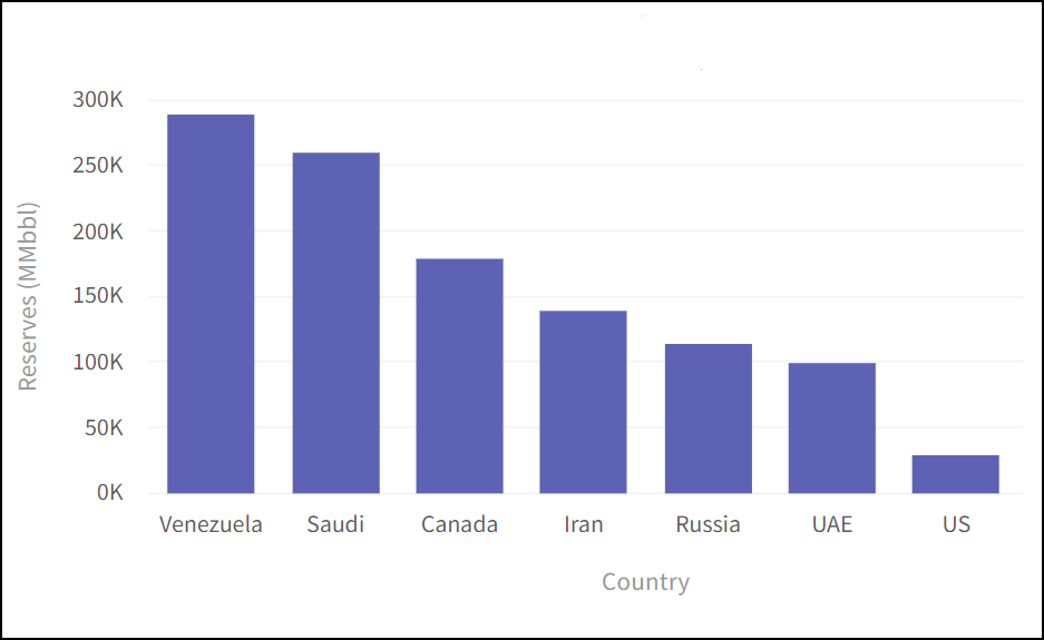
Once you have installed FusionCharts and have included the dependencies, you need to prepare the chart data. In the following example, the data of fossil fuel reserves present in various countries is shown in tabular form:
| Country | No. of fossil fuel reserves |
| Venezuela | 290K |
| Saudi Arabia | 260K |
| Canada | 180K |
| Iran | 140K |
| Russia | 115K |
| UAE | 100K |
| US | 30K |
| China | 30K |
FusionCharts accepts the data in JSON format. So the above data will take the below shape.
| // Preparing the chart data const chartData = [ { label: “Venezuela”, value: “290” }, { label: “Saudi”, value: “260” }, { label: “Canada”, value: “180” }, { label: “Iran”, value: “140” }, { label: “Russia”, value: “115” }, { label: “UAE”, value: “100” }, { label: “US”, value: “30” }, { label: “China”, value: “30” } ]; |
Step 4: Configure your chart
Now that the data for your chart is ready, let’s work on styling, positioning, and giving your chart context.
Height and width: The size of the chart is defined using ‘width’ and ‘height’ attributes.
Type: ‘Type’ defines the type of chart you are going to plot.
Chart: The ‘chart’ object under ‘DataSource’ contains chart configuration options like theme and display formats for numbers.
| // Create a JSON object to store the chart configurations const chartConfigs = { type: “column2d”, // The chart type width: “700”, // Width of the chart height: “400”, // Height of the chart dataFormat: “json”, // Data type dataSource: { // Chart Configuration chart: { caption: “Countries With Most fossil fuel Reserves [2017-18]”, //Set the chart caption subCaption: “In MMbbl = One Million barrels”, //Set the chart subcaption xAxisName: “Country”, //Set the x-axis name yAxisName: “Reserves (MMbbl)”, //Set the y-axis name numberSuffix: “K”, theme: “fusion” //Set the theme for your chart }, // Chart Data – from step 2 data: chartData } }; |
Step 5: Render the chart
Now, with all the pieces of the puzzle solved, it is time to combine everything from above and render the Simple Chart. Here’s the consolidated code to render the Simple Chart.
| // STEP 1 – Include Dependencies // Include react import React from “react”; import ReactDOM from “react-dom”; // Include the react-fusioncharts component import ReactFC from “react-fusioncharts”; // Include the fusioncharts library import FusionCharts from “fusioncharts”; // Include the chart type import Column2D from “fusioncharts/fusioncharts.charts”; // Include the theme as fusion import FusionTheme from “fusioncharts/themes/fusioncharts.theme.fusion”; // Adding the chart and theme as dependency to the core fusioncharts ReactFC.fcRoot(FusionCharts, Column2D, FusionTheme); // STEP 2 – Chart Data const chartData = [ { label: “Venezuela”, value: “290” }, { label: “Saudi”, value: “260” }, { label: “Canada”, value: “180” }, { label: “Iran”, value: “140” }, { label: “Russia”, value: “115” }, { label: “UAE”, value: “100” }, { label: “US”, value: “30” }, { label: “China”, value: “30” } ]; // STEP 3 – Creating the JSON object to store the chart configurations const chartConfigs = { type: “column2d”, // The chart type width: “700”, // Width of the chart height: “400”, // Height of the chart dataFormat: “json”, // Data type dataSource: { // Chart Configuration chart: { //Set the chart caption caption: “Countries With Most fossil fuel Reserves [2017-18]”, //Set the chart subcaption subCaption: “In MMbbl = One Million barrels”, //Set the x-axis name xAxisName: “Country”, //Set the y-axis name yAxisName: “Reserves (MMbbl)”, numberSuffix: “K”, //Set the theme for your chart theme: “fusion” }, // Chart Data data: chartData } }; // STEP 4 – Creating the DOM element to pass the react-fusioncharts component class App extends React.Component { render() { return (<ReactFC {…chartConfigs} />); } } export default App; |
Once you have rendered the chart, you should be able to see the Simple Chart, as shown below:
Now that you know how to create a simple chart in React application using FusionCharts, let’s find out about some other features of FusionCharts. Here are some chart demos that are created using FusionCharts in React applications.
World map
To render a world map chart, you need to use the following consolidated code:
import React, { Component } from ‘react’
import FusionCharts from ‘fusioncharts’;
import Maps from ‘fusioncharts/fusioncharts.maps’;
import World from ‘fusioncharts/maps/fusioncharts.world’;
import ReactFC from ‘react-fusioncharts’;
import FusionTheme from ‘fusioncharts/themes/fusioncharts.theme.fusion’;
ReactFC.fcRoot(FusionCharts, Maps, World, FusionTheme);
const chartConfigs = {
type: ‘world’,
width: 600,
height: 400,
dataFormat: ‘json’,
dataSource: {
“chart”: {
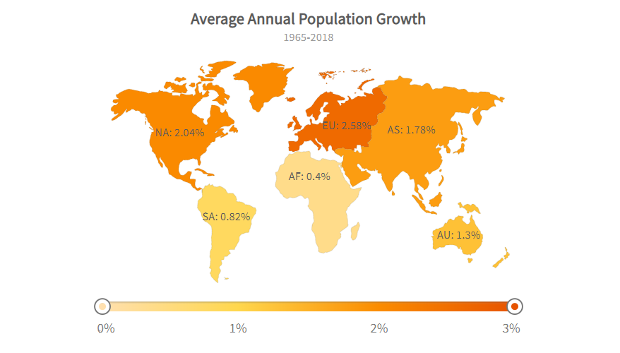
“caption”: “Average Annual Population Growth”,
“subcaption”: ” 1965-2018″,
“numbersuffix”: “%”,
“includevalueinlabels”: “1”,
“labelsepchar”: “: “,
“entityFillHoverColor”: “#FFF9C4”,
“theme”: “fusion”
},
“colorrange”: {
“minvalue”: “0”,
“code”: “#FFE0B2”,
“gradient”: “1”,
“color”: [
{
“minvalue”: “0.5”,
“maxvalue”: “1.0”,
“color”: “#FFD74D”
},
{
“minvalue”: “1.0”,
“maxvalue”: “2.0”,
“color”: “#FB8C00”
},
{
“minvalue”: “2.0”,
“maxvalue”: “3.0”,
“color”: “#E65100”
}
]
},
“data”: [
{
“id”: “SA”,
“value”: “.82”,
“showLabel”: “1”
},
{
“id”: “NA”,
“value”: “2.04”,
“showLabel”: “1”
},
{
“id”: “AS”,
“value”: “1.78”,
“showLabel”: “1”
},
{
“id”: “AF”,
“value”: “.40”,
“showLabel”: “1”
},
{
“id”: “EU”,
“value”: “2.58”,
“showLabel”: “1”
},
{
“id”: “AU”,
“value”: “1.30”,
“showLabel”: “1”
}
]
},
};
export default class App extends Component {
render () {
return <ReactFC {…chartConfigs} />;
}
}
Once you have rendered the world map chart, you should be able to see the world map as shown below:
Simple gauge demo
To render a simple gauge chart, check the following consolidated code:
import React, { Component } from ‘react’;
import FusionCharts from ‘fusioncharts’;
import Widgets from ‘fusioncharts/fusioncharts.widgets’;
import ReactFC from ‘react-fusioncharts’;
import FusionTheme from ‘fusioncharts/themes/fusioncharts.theme.fusion’;
ReactFC.fcRoot(FusionCharts, Widgets, FusionTheme);
const chartConfigs = {
type: ‘angulargauge’,
width: 600,
height: 400,
dataFormat: ‘json’,
dataSource: {
“chart”: {
“caption”: “USA Customer Satisfaction Score for 2018”,
“lowerLimit”: “0”,
“upperLimit”: “100”,
“showValue”: “1”,
“numberSuffix”: “%”,
“theme”: “fusion”,
“showToolTip”: “0”
},
“colorRange”: {
“color”: [
{
“minValue”: “0”,
“maxValue”: “25”,
“code”: “#F2726F”
},
{
“minValue”: “25”,
“maxValue”: “75”,
“code”: “#FFC533”
},
{
“minValue”: “75”,
“maxValue”: “100”,
“code”: “#62B58F”
}
]
},
“dials”: {
“dial”: [
{
“value”: “75”
}
]
}
},
};
export default class App extends Component {
render () {
return <ReactFC {…chartConfigs} />;
}
}
Once you have rendered the chart, you should be able to see the simple gauge chart, as shown below:

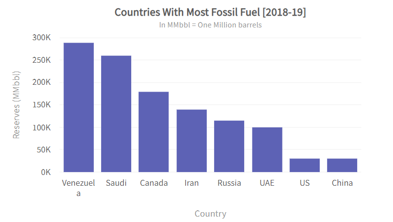
Data binding demo
To render it, you need to use the following consolidated code:
import React, { Component } from ‘react’;
import FusionCharts from ‘fusioncharts’;
import Charts from ‘fusioncharts/fusioncharts.charts’;
import ReactFC from ‘react-fusioncharts’;
import FusionTheme from ‘fusioncharts/themes/fusioncharts.theme.fusion’;
ReactFC.fcRoot(FusionCharts, Charts, FusionTheme);
const chartConfigs = {
type: ‘column2d’,
width: 600,
height: 400,
dataFormat: ‘json’,
dataSource: {
“chart”: {
“caption”: “Countries With Most Fossil Fuel [2018-19]”,
“subCaption”: “In MMbbl = One Million barrels”,
“xAxisName”: “Country”,
“yAxisName”: “Reserves (MMbbl)”,
“numberSuffix”: “K”,
“theme”: “fusion”,
“updateAnimDuration”: “0.4”
},
“data”: [
{
“label”: “Venezuela”,
“value”: “290”
},
{
“label”: “Saudi”,
“value”: “260”
},
{
“label”: “Canada”,
“value”: “180”
},
{
“label”: “Iran”,
“value”: “140”
},
{
“label”: “Russia”,
“value”: “115”
},
{
“label”: “UAE”,
“value”: “100”
},
{
“label”: “US”,
“value”: “30”
},
{
“label”: “China”,
“value”: “30”
}
]
},
};
export default class App extends Component {
constructor(props) {
super(props);
this.state = chartConfigs;
this.updateData = this.updateData.bind(this);
}
// This function generates random number.
getRandomNumber() {
var max = 290, min = 30;
return Math.round(((max – min) * Math.random()) + min);
}
// Handler for update button.
// Randomly updates the values of the chart.
updateData() {
var prevDs = Object.assign({}, this.state.dataSource);
prevDs.data[2].value = this.getRandomNumber();
prevDs.data[3].value = this.getRandomNumber();
this.setState({
dataSource: prevDs,
});
}
render() {
return (
<div>
<ReactFC {…this.state} />
<center>
<button
className=’btn btn-outline-secondary btn-sm’
onClick={this.updateData}
>
Change Chart Data
</button>
</center>
</div>
);
}
}

Life cycle events demo
To showcase life cycle events, check the following snippet of code:
import React, { Component } from “react”;
import FusionCharts from “fusioncharts”;
import Charts from “fusioncharts/fusioncharts.charts”;
import ReactFC from “react-fusioncharts”;
import FusionTheme from “fusioncharts/themes/fusioncharts.theme.fusion”;
ReactFC.fcRoot(FusionCharts, Charts, FusionTheme);
const chartConfigs = {
type: “column2d”,
width: 600,
height: 400,
dataFormat: “json”,
dataSource: {
“chart”: {
“caption”: “Countries With Most Fossil Fuel [2018-19]”,
“subCaption”: “In MMbbl = One Million barrels”,
“xAxisName”: “Country”,
“yAxisName”: “Reserves (MMbbl)”,
“numberSuffix”: “K”,
“theme”: “fusion”
},
“data”: [
{
“label”: “Venezuela”,
“value”: “290”
},
{
“label”: “Saudi”,
“value”: “260”
},
{
“label”: “Canada”,
“value”: “180”
},
{
“label”: “Iran”,
“value”: “140”
},
{
“label”: “Russia”,
“value”: “115”
},
{
“label”: “UAE”,
“value”: “100”
},
{
“label”: “US”,
“value”: “30”
},
{
“label”: “China”,
“value”: “30”
}
]
}
};
export default class App extends Component {
constructor(props) {
super(props);
this.state = {
message:
“You will see a notifications here for the chart lifecycle events”
};
this.beforeDataUpdate = this.beforeDataUpdate.bind(this);
this.dataUpdated = this.dataUpdated.bind(this);
this.drawComplete = this.drawComplete.bind(this);
this.renderComplete = this.renderComplete.bind(this);
}
// Callback handler for event ‘beforeDataUpdate’.
beforeDataUpdate() {
this.state.message = [<strong>Status: </strong>, ” beforeDataUpdate”];
}
// Callback handler for event ‘dataUpdated’.
dataUpdated() {
let newMessage = this.state.message.slice();
newMessage.push(“, dataUpdated”);
this.setState({
message: newMessage
});
}
// Callback handler for event ‘drawComplete’.
drawComplete() {
let newMessage = this.state.message.slice();
newMessage.push(“, drawComplete”);
this.setState({
message: newMessage
});
}
// Callback handler for event ‘renderComplete’.
renderComplete() {
let newMessage = this.state.message.slice();
newMessage.push(“, renderComplete”);
this.setState({
message: newMessage
});
}
render() {
return (
<div>
<ReactFC
{…chartConfigs}
fcEvent-beforeDataUpdate={this.beforeDataUpdate}
fcEvent-dataUpdated={this.dataUpdated}
fcEvent-drawComplete={this.drawComplete}
fcEvent-renderComplete={this.renderComplete}
/>
<p style={{ padding: “10px”, background: “#f5f2f0” }}>
{this.state.message}
</p>
</div>
);
}
}
Final Takeaway
Whether you want to create a simple chart or pie chart or an advanced zoom and scroll chart in a React app, using FusionCharts to make it would be your best bet. Widely regarded as one of the best data-visualization tools, FusionCharts leverages JavaScript (HTML5) and Flash to create stunning data visualizations unmatched by conventional server-side components. As this JavaScript charting library works with both XML and JSON data, it can be integrated with databases and any server-side technology like ASP, PHP, and JSP, among others. While creating charts in React applications using FusionCharts may seem like a daunting task, the process is fairly simple and straightforward.
By following the above steps, you can quickly and effortlessly create beautiful charts in React applications using FusionCharts.
The FusionCharts React package gives you the best of both worlds. You can use the power of JavaScript to embed and manipulate the charts while taking full advantage of FusionCharts’ powerful charting engine.
FusionCharts is a very simple library to use and has support for all the latest technologies like Angular, Vue, and React. The React documentation shows the available components by default, but it might be worth your time to check out the FusionCharts documentation to see where you can customize the library for your next project.


 How to Calculate Crypto Currency Exchange Rates with Coinlayer