


It takes as less as 50 milliseconds for visitors to decide whether or not they want to stay on your website! Websites are often subject to snappy and ruthless judgment influencing peoples’ perceptions of a brand.
With a simple Google search, they can fetch thousands of potential solutions, whereas a basic and lousy website won’t do it for them. You need a high-converting website with every page element on point—design, layout, or copy to grab and retain their attention.
This article will cover seven essential yet often overlooked elements that you cannot afford to ignore in today’s day and age. You’ll uncover how these elements can impact your online sales and how you can use them best!
Essential website elements that drive conversion
Building a visually appealing and conversion-driven website can be overwhelming, especially when you have too many products to showcase. But don’t worry, our seven-point checklist will help you ensure that.
Let’s dig in!
1. Get them familiar with the product up close
How you visually present your products on the website greatly impacts the worthiness of your brand.
No, we’re not talking about investing in big-shot tools and professional studios to get aesthetically perfect pictures! It’s all about getting high-quality images of your product from all angles giving them even the tiniest underlying detail of the product.
Instead of just having a large image of the product, show them the size, texture, corners, labels, and stitching to get them a real-life shopping experience. They must know how the product looks up close and what it’s like to feel it.
For example, look at how Home Depot has done it for a memory foam mattress.
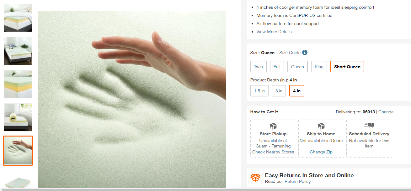
source
2. Place social proof subtly
People are more likely to buy from you when they see others doing the same thing. All you need to do is put it out there on your website that your brand is loved and trusted by customers.
Naturally, we all like to see how others feel about a product before we invest in it. It helps potential buyer complete their order faster when you have reviews pouring in for a product.
Strategically place these reviews throughout your website—on product pages, home pages, or emails. Also, make it easier for customers to leave reviews on your website while encouraging them to leave feedback through emails.
Another popular trend on many websites is the live sale notification, wherein every customer browsing your products will see a notification about how other users are interacting with it. As an example, check out how OptinMonster does it on their website.
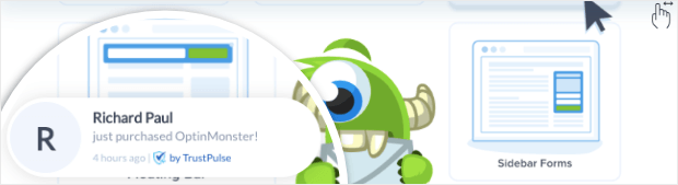
source
Lastly, you can explore the option of placing impressive stats about your sales, sign-ups, and product popularity on your page. For example, mention on your website that your newsletter is adored by 10,000 customers or showcase the most popular product in your store. This will create FOMO (Fear of Missing Out) in them, and they’ll get tempted to take action.
3. Work on improvising the UX of your website
The UX, a.k.a user experience of your website, not only improves how users interact with your website but also increases your website’s positioning on the SERP and overall performance and visibility.
For that, you need to be mindful of what you put on your website regarding content, functionality, or accessibility.
- Publish super-relevant content to your target customer and something they care about.
- Use simple themes and make your website easy to navigate.
- Don’t put irrelevant and unnecessary content and large files that only take up space and decrease the loading time of your website.
- Customer support is everything. Make sure to make it explicit about the various ways in which they can reach out to you.
- Optimize the site for mobile use.
4. Offer a smooth checkout journey
Wish to save your customers from endless checkout windows to complete one transaction? The shorter and simpler you keep their checkout journey, the lesser are chances of them leaving their carts abandoned!
You can explore something called ‘order forms’ to streamline this process by being as clear about your product as possible! It’s basically a form in which you provide every information customers need to know about the product, including the variations and colors you offer, and a payment section where they can add in their information.
The benefits:
- Advanced features, including price calculations and taxes
- Enhanced security, hence more customer trust
- Easy to collect customer information
- Better conversion rates
Easy online form builder to the rescue!
When choosing a reliable and secure form builder, you may find yourself lost in the sea of available options out there!
Luckily, easy online form builders can help you create stunning and high-converting order forms in less time. The best part—you can get started for free and explore some of their basic features. With many templates at your disposal, including registration forms, payment forms, feedback forms, membership forms, and a lot more, imagine the seamless experience you can offer your customers with this magical tool!
Below is an example of an advertisement order form that a company fills out when looking to advertise its products on an online medium.
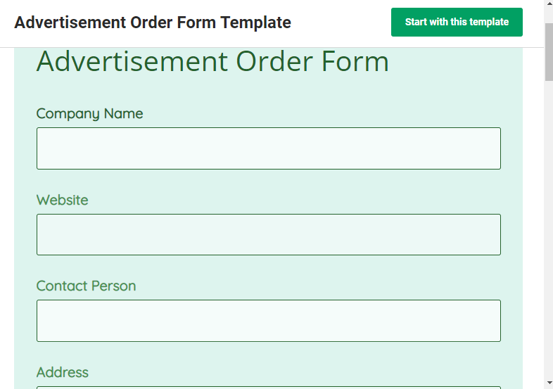
source
5. Practice security protocols
It’s very difficult to build customers’ trust online, especially regarding online payments. This has become a critical issue as we live when cyber attacks are rising, and even many large enterprises have fallen victim to it!
Here are some ways you can build your customers’ trust and ensure them that you’re doing everything to keep their data secure from attackers.
SSL encryption
It’s the basic measure you can take for your website to ensure that any sensitive information is securely transferred between your website and users’ browsers. It prevents unauthorized access, improves your SEO rankings, and also boosts your site’s speed.
Trust badges
Trust badges are an effective way to tell your customers that your site is safe for online payments. These are mainly icons that show that your website is trusted by well-known brands such as PayPal, which adds credibility to your site.
2-factor authentication
Often, attackers leverage a weak password to break into a server and get access to confidential data. Poor and easy-to-guess passwords are the root cause of this problem.
Solution? Besides setting up strong and complex passwords, adding 2-factor authentication to your login process will add an extra layer of security. This involves setting up an authorization step wherein, after you’ve entered your username and password, you would require to enter a code to log in successfully.
6. Provide clear pricing information
When writing a product description, never leave the customers guessing what all it includes. Most importantly, if you’re offering tiered packages for your products or services, explain what each tier includes.
How do you show pricing in a better way? Focus on benefits instead of features. Show your customers how your product will help them in life and what values they will get from it. For tiered pricing, specify differences between tiers.
For example, check out how elaborately Hubspot has laid out its pricing plan for different tiers.
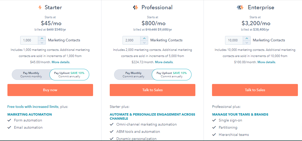
source
7. Write good copy
Last but not the least is the website copy—make it super crisp, informative, and most importantly, skimmable.
Here are some steps that you can use to write a high-conversion website copy.
Understand the goal and target market
Know who you’re selling to and what problem your offer solves for them. Also, highlight the USP (Unique Selling Proposition) of your offer. It helps you pitch your offer in a way that hits the right spot and tempts your customers to make the purchase.
Create an outline
Every website follows a structure, including design elements, images, copy, headers, and CTAs. Create a rough outline of everything you include in your website, keeping the design and template in mind, and write copy for individual sections
Pay utmost attention to the header
The header is the first thing your website visitors will notice when they land. Make sure to put out your best to form an ever-lasting impression!
A header should talk about the page’s what, why, and for whom—what the page is about, who it is for, and why they need it. It has a headline, a concise summary, and a crystal-clear call to action. The header part must be immediately visible to visitors, standing out from the other sections with vibrant colors as soon as they open it.
In a nutshell
You see, it’s all about following the right strategies and leaving no stone unturned when finding success in online media. Include these elements in your website, and be assured that nothing can stop you from driving more revenue!


