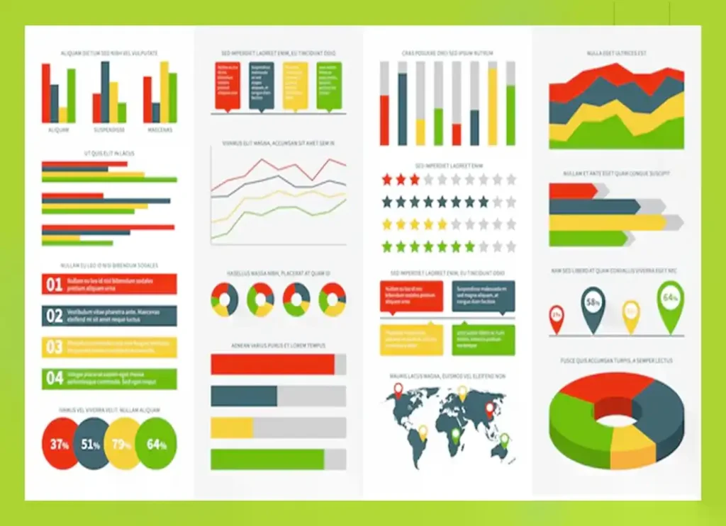
Our world is digital through and through. Literally, everything and every part of our life is controlled and managed using a variety of digital tools. While the process of digitalization has almost reached its final stage, the ‘datalization’ is experiencing its rise. Data is everywhere and it grows exponentially influencing significantly all the processes in business, statistics, medicine, education, etc.
Proper data analysis enables businesses to make decisions, change strategies, improve the quality of produce, and communicate with clients and partners more efficiently. Data is an essential assistant and leverage for every business owner, as it represents the complete picture and insights into the workflow. Using the right tools, every company can take advantage of data analysis in order to upgrade its work and strengthen its position in the market.
The best medium between the amounts of data and business is pictorial representation – maps, charts, videos, graphs, infographics, etc. Visualization is the most efficient way to show vast amounts of data in a comprehensible format.
When hearing the words ‘graph’, ‘chart’, and ‘diagram’, people typically imagine the same thing – lines, numbers, and their interrelation and integration. Yet, they are different and can’t be used interchangeably:
- Charts are presented in the form of tables, pictures, or diagrams. They help to organize large data amounts clearly; besides, they can help to make predictions based on current trends.
- Graphs are used to represent raw data, the relation between the numbers, and their changes.
When creating the visuals it’s important to consider the most practical types of graphs and charts, to convey a clear message and be precise with data. When just starting to work with pictorials, it may seem a daunting experience. Therefore, to avoid inaccuracies, it’s better to use an online guide, like VistaCreate, to make sure everything is designed and organized correctly.
Data visualization is an asset for every business as it helps to:
- Brainstorm ideas and track what influence they can make on the overall situation.
- Analyze the work of every separate department, revealing errors and inaccuracies.
- Present the results of the work to the stakeholders.
- Motivate and encourage the team to work.
- Show the values of the company.
The most common graph types for data visualization:
- Line graph – uses an axis to illustrate certain changes in data over a certain period of time. It is created by using several dots linked by straight lines and comprises two axes – the “x-axis” and the “y-axis”. The horizontal axis is called the x-axis.
One axis may show the price, the other – a timeline line; temperature – dates; age – purchases, etc.
Line graphs are practical as they reflect the trends very clearly and can help to anticipate the results of data which is not received yet.
- Area graph – is very much like a line graph. It is used to illustrate the change in quantities over a period of time. It typically is used to expose trends and patterns. To show the interrelation between the values, the dots are used and connected by a line. A major difference between a line graph and an area graph is the coloring. It helps to highlight and compare different trends over the same timeframe.
- Bar graph – illustrates the comparison of numeric values or items, financial predictions, and changes over time. The marketing department often uses bar graphs to show survey responses, ratings, etc. Bar graphs can be both – horizontal and vertical (column). The heights or lengths are proportional to the values that they represent.
The most common types of charts:
1. Flowchart – organizes all the steps, actions, and decisions to take. Basically, it helps to show all the paths that can be taken along the way from the start to the endpoint. It is particularly useful for complex situations, in order to find all the possible solutions. Flowcharts work perfectly to show the causal relationship between all the steps taken.
2. Waterfall chart – works perfectly when the company needs to show financial statements, compare the profits and losses, budget vs amount spent, etc. Waterfall displays changes over time demonstrating the positive and negative influence of different factors on the initial value. Besides, the changes can be shown with the help of color code.
3. Funnel chart – is organized in a series of stages, with the widest at the top, and the narrowest at the bottom. It is typically used for tracking sales processes, depicting website traffic, etc. It is the way to visualize a linear process that has connected stages.
When gathering information for creating the visuals, it’s important to understand the types of data and define what type is the most suitable to show the relations between the values:
- Qualitative – subjective and dynamic, typically about individual understanding and perception of event and situations. The typical characteristics to describe – texture, color, shape, taste, feelings, etc.
- Quantitative – objective – facts, figures, something that can be measured using standard scales.
The efficiency of business performance is driven by the efficiency of their data usage, as it provides an insight into all the processes happening within – strengthens and weaknesses of the company, campaign, strategies and performance. With the proper visualization and analysis, data usage can stimulate the growth and development of the company.


 20 Future Programming Languages in 2023